There\’s a piece by urban maven Richard Florida on The Atlantic Cities blog, summarising some research on the link between urban density and productivity. What is perhaps more interesting than the fact that there is a link (talented people and businesses benefit from \’agglomeration\’ and are drawn to the locations that support it) is the fact that this only works for cities with high levels of skills:
\”[the report] notes that density plays a bigger role in cities where levels of skill and human capital are higher. Metro areas with below average levels of human capital realize no productivity gains from density, the study finds, while doubling density in metros with above average human capital gain productivity benefits that are roughly twice the average. This \”negative net agglomeration effect\” found in less skilled metros leads the authors to conclude that the negative effects of congestion swamp the positive effects of urbanization in less skilled places.\”
That is to say, densification works for you if you live – put bluntly – in a middle-class professional city, but less well if you are in a low-skilled working class city. This seems to highlight something that is little remarked on by professional density fans like me, even if it is about people and communities within cities, rather than cities as economic entities. For all the benefits (viability of local services, lower car dependency, lower carbon impact) that high density urban living can offer, high density means different things for different classes: living in the Barbican and living in the Heygate Estate are different experiences, even if cast from the same concrete. Notting Hill is not Canning Town.
So how does density relate to deprivation? In London, the most densely populated wards include both some of the richest and some of the poorest (Tachbrook and Green Street East (in Westminster and Newham respectively)), but the poorer wards are denser overall. The graph below shows London\’s 620 wards grouped in order of their average rank in the 2007 Index of Deprivation, with their population density on the vertical axis.
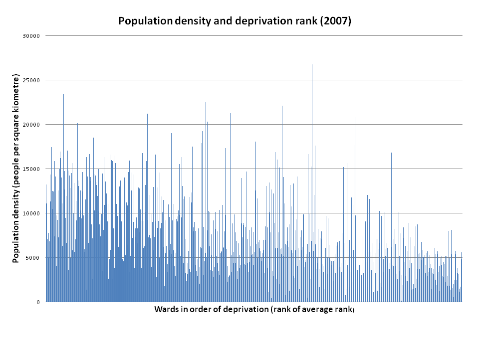
The co-efficient of correlation is -0.48, which implies some relationship between high deprivation rankings and high density, if not a precise one (IMPORTANT HEALTH WARNING: this blog post involves me using statistical formulae and large datasets, so should be treated with something between suspicion and disdain). So far, so unsurprising. Poorer areas are more likely to be in the inner city (so likely to be denser), and also likely to include fewer fripperies like parks that would detract from density (when measured as people per square kilometre, rather than as dwellings per hectare). Prosperous areas that look dense because they are built up may actually be low density in terms of residents (from, for example, single people or couple living in larger flats with spare rooms).
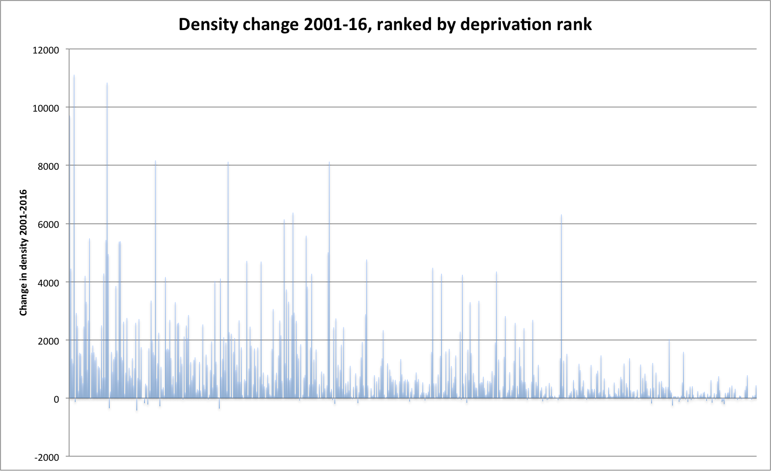
So, if that\’s our starting point, how has London been changing in recent years? The chart below shows actual and projected changes in population density (2001-16), against deprivation rank.